.png)
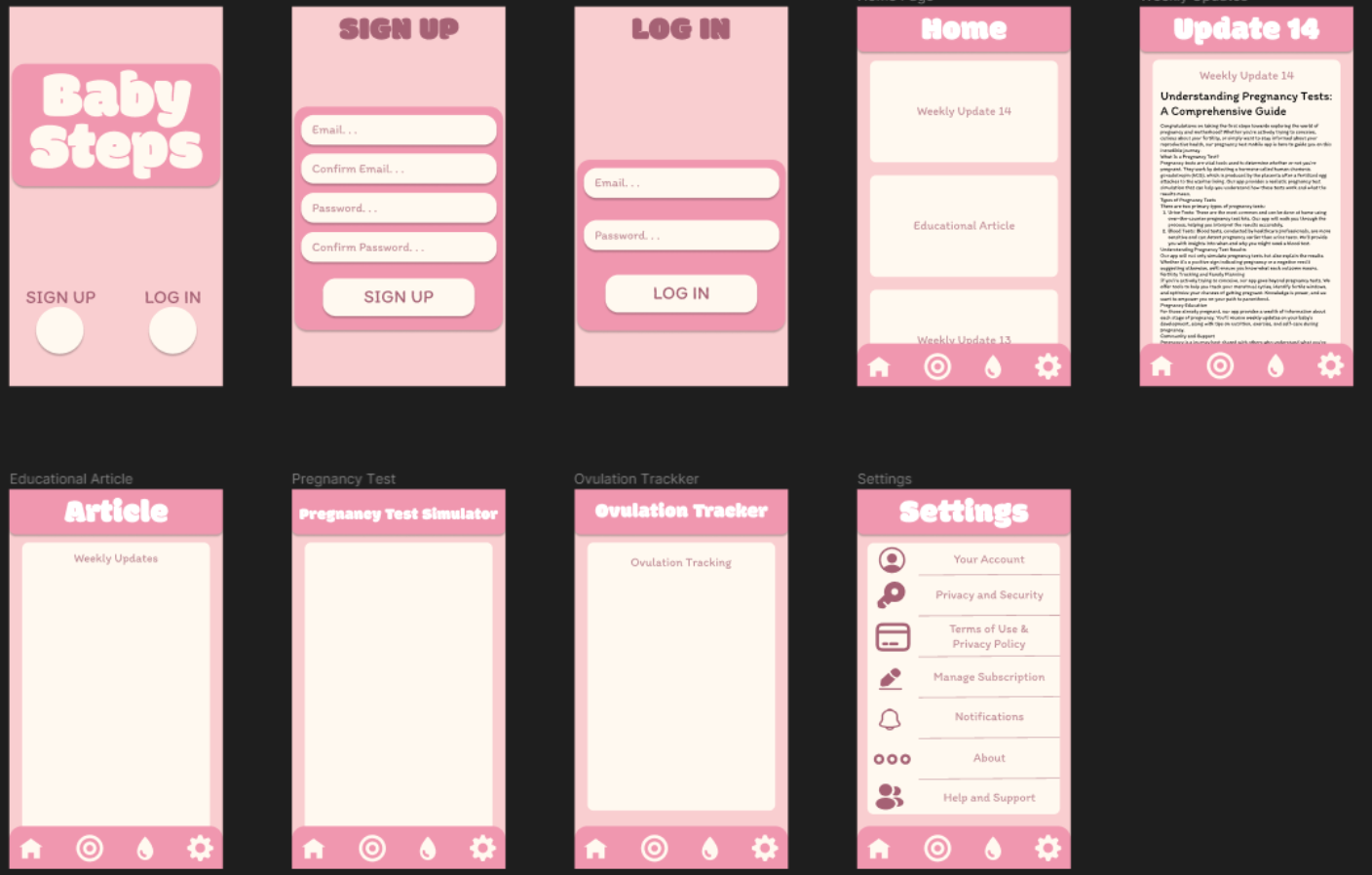
After fleshing out the UI, I changed the color code to be more maroon instead as I felt that in my previous iteration, pink was having too much of a negative effect on readability. Near the end of the project, this app proved to be great practice for basic typography and layout. I was also able to fix some misalignments in page layouts which allowed me to learn things I would've otherwise missed, i.e. how elements show up in actual lighting (sunlight). Thank you for reading!


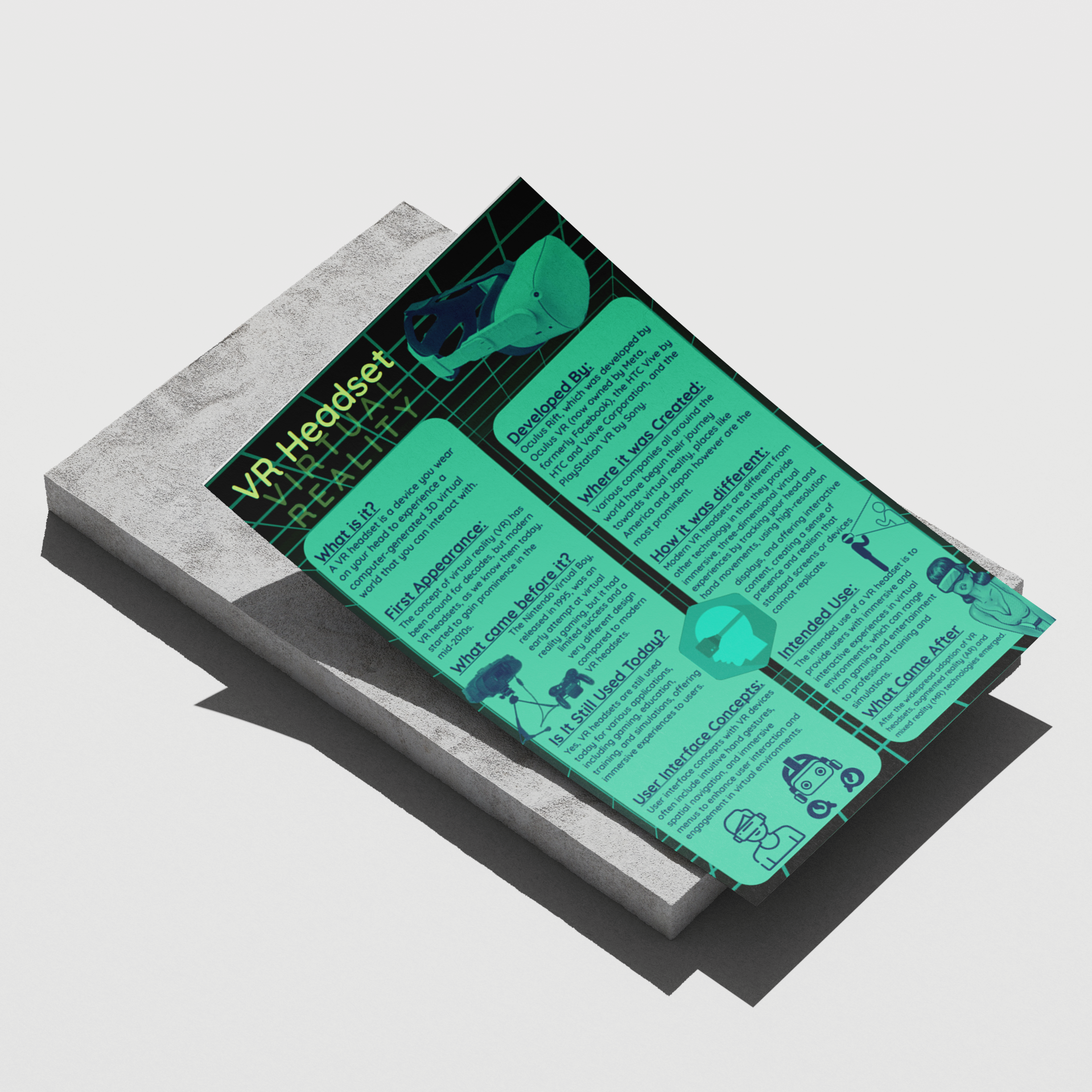
.png)
.png)